ALL PROJECTS

Graphic DESIGNING
Invitation
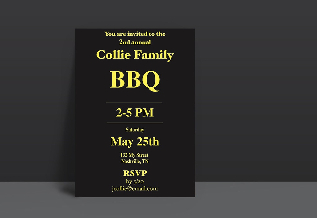
In the design for the Collie Family BBQ invitation, I've opted for a sleek and modern look. The background is a solid black, which creates a striking contrast with the bright yellow text, making the invitation eye-catching and easy to read. At the top, I've included a header that says "You are invited to the 2nd annual" in a smaller, italicized font to add a touch of elegance. Below that, the main title "Collie Family BBQ" is prominently displayed in a larger, bold serif font, emphasizing the event and making it the focal point. The event details, such as the time "2-5 PM," the day "Saturday," and the date "May 25th," are centered on the invitation and aligned in a hierarchical manner to ensure clarity and easy readability. I’ve used a similar bold font for these details to maintain consistency and balance throughout the design. The location is listed at the bottom in a smaller, yet still legible font, providing the necessary information without overpowering the other elements. The RSVP section is highlighted with a clear deadline and contact information, ensuring guests know how and when to respond. Overall, the minimalist design and strategic use of typography make this invitation both stylish and functional, effectively communicating all the necessary information at a glance.

Graphic Design
Quote
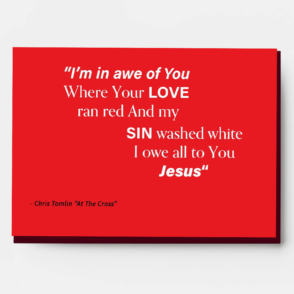
For this design featuring lyrics from Chris Tomlin's song "At The Cross," I’ve chosen a striking red background to convey the powerful emotions and themes of the song. The bold red color symbolizes the love and sacrifice referenced in the lyrics. The text is centered on the card, using a combination of fonts and sizes to highlight key words and phrases. The lyrics are displayed in a white serif font, providing a sharp contrast against the red background for readability and impact. Key words like "LOVE," "SIN," and "Jesus" are emphasized by using a bold font. This not only draws attention to these significant words but also helps to convey the message of the lyrics more powerfully. The phrase "I'm in awe of You" at the top is italicized and bold, capturing the reverence and admiration expressed in the song.
ALL PROJECTS

Graphic DESIGN
Menu
In designing this menu for Joe's Java, I aimed for a bold and rustic aesthetic. The background features a textured, dark slate pattern, adding a gritty feel that complements the coffeehouse vibe. I used a white, hand-painted style font for the header "JOE'S JAVA" and the item names, creating a contrast that draws attention and gives a personal, handcrafted impression. The descriptions are written in a clean font to ensure readability while maintaining the overall theme. Pricing is clearly listed on the right side of each item for easy viewing. The menu is designed to be visually engaging while providing a straightforward, easy-to-navigate layout for customers.

Poster Mockup
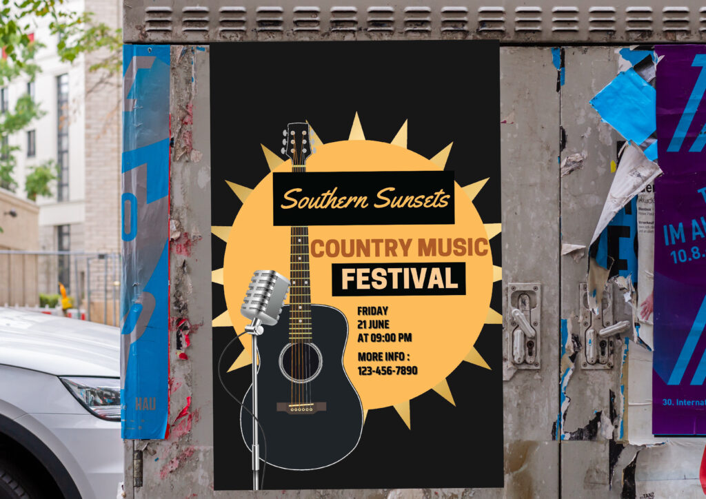
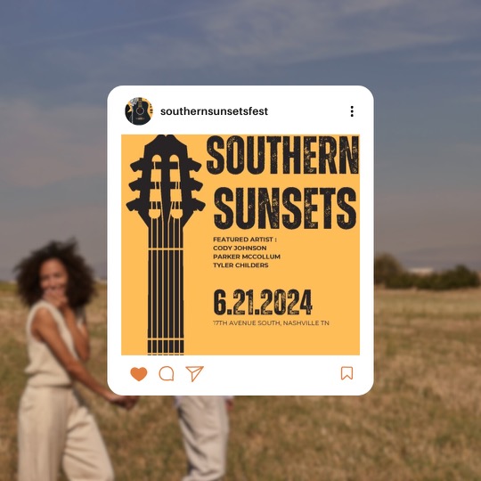
For the Southern Sunsets Country Music Festival poster, I’ve created a bold and vibrant design that captures the spirit of the event. The background is a deep black, providing a strong contrast to the other elements and making the design stand out. At the center, I’ve placed a large, bright yellow sunburst graphic, symbolizing the "Southern Sunsets" theme. This element immediately draws attention and creates a warm, inviting atmosphere. Overlaid on the sunburst is a sleek black acoustic guitar and a classic silver microphone, reinforcing the musical aspect of the event. The event title, "Southern Sunsets Country Music Festival," is divided into two parts for visual interest. "Southern Sunsets" is written in a cursive, elegant font in a yellow color that ties into the sunburst, while "Country Music Festival" is displayed in a bold, uppercase font in orange and white, ensuring it is prominent and easy to read. Below the main title, the event details such as the date "Friday 21 June," the time "at 09:00 PM," and additional contact information "More Info: 123-456-7890" are listed in a clean, straightforward font. This information is centered and organized in a way that maintains the overall balance of the design. Overall, the poster uses a combination of bold colors, strong typography, and relevant graphics to create an eye-catching and informative design that effectively promotes the Southern Sunsets Country Music Festival. Alongside the poster are some social media graphics that also promote the southern sunsets country music festival.
